Sherwin Williams, along with other leading paint company's all agree that white is "it" for 2016.
Architecture and interior design magazines have featured all-white interiors for quite a while. A neutral backdrop photographs well and perfectly highlights colorful furniture and artwork.Sherwin Williams selected Alabaster/SW7008 as their white for this year. They describe it as, "A straightforward and necessary shift to mindfulness. It provides an oasis of calmness, spirituality and ‘less is more’ visual relief. Alabaster is neither stark nor overly warm, but rather an understated and alluring white.”
Sienna Lynn Studio's view:
Although white walls and ceilings tend to brighten a space, it can also look unfinished or too stark if done without color in mind. The use of color becomes increasingly important with a primary palette of white. I do love Sherwin William's off-white "Alabaster" and have specified it frequently as a warm neutral. However there are also projects where a true, extra white works best. Emphasis your favorite furniture or artwork in residential, and showcase branding elements in commercial spaces. I especially like contrasting white with medium and dark gray tones.
Residential examples of white interiors by Sienna Lynn Studio:
Classic modern interior using Alabaster white with warm tones.
Commercial examples of white interiors by Sienna Lynn Studio:
Marketing firm with brick painted Alabaster, along with vivid company branding colors.
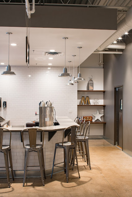
Coffee shop with extra white on walls and ceiling, contrasted with shadowy gray accents.
Clean and crisp. Whites freshen and brighten interior spaces. I welcome the whites but will continue to incorporate and showcase COLOR into my interiors as well.
-Jodi Kuznia
Interior Design Principal
Sienna Lynn Studio
Sienna Lynn Studio


No comments:
Post a Comment