Showing posts with label color. Show all posts

Monday, April 16, 2018

plan b

Winter fatigue. 
That's a good way to describe how we're all feeling in Minnesota these days.


This past weekend we had a huge spring blizzard keeping most of us stuck at home. Making chili, drinking wine, playing hide-and-go-seek, play dough, and hanging outside in the snow.  Definitely Plan B.

More snow in the forecast for this week. We live in the deep-freeze from November through April (that's half of the year folks!) It's Minnesota and I'm used to this, but let me tell you, the spring fever is cray-zeeee! 

We're all in it together. Doing what we can to stay motivated and make the most of this time of year. Sunshine helps.

Similarly when working through interior design phases, flexibility is key to a smooth project. I've found that Plan B sometimes IS the best. 

Thursday, December 7, 2017

pantone color of the year

Today Pantone Color Institute reveals The Color of the Year for 2018... Ultra Violet

"As individuals around the world become more fascinated with color and realize its ability to convey deep messages and meanings, designers and brands should feel empowered to use color to inspire and influence. The Color of the Year is one moment in time that provides strategic direction for the world of trend and design, reflecting the Pantone Color Institute’s year-round work doing the same for designers and brands."  -Pantone Color Institute 
I love reading the online posts today about the chosen color. So many ways to interpret what this color means within our culture, along with past and present events in society. 

Purple hues have several universal meanings. Musical influence (Prince), political uncertainty (Republican red+ Democratic blue), historical (wealth and royalty), and our Minnesota football team the Vikings.  For some, violet represents the unknown limitless galaxy, non-conformity, unconventionality, optimism...


My favorite addition to this year's color is the complimentary color pairings. I do love these combinations:


We will see a lot more purple in 2018...and hopefully more peace.💜

Wednesday, October 25, 2017

red indeed

NEXT UP | Another office building full remodel.

Dramatic red accents will be incorporated in paint, furniture, signage, custom art murals and installations throughout. Can't wait.

And guess what? Benjamin Moore just announced their 2018 Color of the Year, which happens to be...RED. 

"This year's choice will stop you in your tracks." - Benjamin Moore


Monday, December 19, 2016

greenery in the loop

Pantone selected the color of the year for 2017:

Sienna Lynn Studio's current project in Minneapolis' North Loop showcases this fresh, vibrant color. 
An office remodel gets new workstations with sit-stand desks, new carpet, and lighting. 
Next month's installation...a new divider wall with12' custom barn doors to separate the work area and conference room. Stay tuned for more photos.


Tuesday, October 18, 2016

autumn inspires

My favorite season, hands down! 
Fall inspirations at Sienna Lynn Studio...

Tuesday, August 30, 2016

on trend

Announced today...
Sherwin Williams anticipates the defining color of 2017 as Poised Taupe.
"This timeless neutral is modern, classic and a beautiful balance of warm and cool." - Sherwin Williams Color Marketing
Perfect timing to share Sienna Lynn Studio's remodel of Second Street Lofts in North Loop which used this hue!

Poised Taupe, the main color in the interior design finish palette. Combined with gold tones, wood and metal elements, this building re-fresh reflects the industrial chic of Northloop, Minneapolis.


Entry stairs with new 12"x 24" tile. Modern, clean lines update the common areas:

New lighting, carpet tiles, and metal floor base, along with Poised Taupe paint color:

Friday, February 5, 2016

pantone sunrise

Rarely do I get out of the house by sunrise. This morning was an exception, which made the early morning drive worth waking up for.

The beautiful frozen landscape was lit up by the two Pantone Colors for 2016! 


          The pairing of pink and baby blue (Rose Quartz and Serenity) was selected by Pantone color experts to represent the color palette for design inspiration this year. 

Already shown on the runways by Chanel, Prada, and Valentino. Both Fendi and Robert Cavalli have Spring collections for men and women with these two shades. Look for more blue for women, pink for men in the upcoming year in fashion, products, graphics and interior design.


"Coinciding with societal movements toward gender equality and fluidity, the consumers’ increased  comfort with using color as a form of expression which includes a generation that has less concern about being typecast or judged, and an open exchange of digital information that has opened our eyes to different approaches to color usage.”  -Pantone Color Institute


Monday, January 4, 2016

2016 color of the year

It may not come as a surprise that the color of the year is...white!  
Sherwin Williams, along with other leading paint company's all agree that white is "it" for 2016.
Sherwin Williams selected Alabaster/SW7008 as their white for this year.  They describe it as, "A straightforward and necessary shift to mindfulness. It provides an oasis of calmness, spirituality and ‘less is more’ visual relief. Alabaster is neither stark nor overly warm, but rather an understated and alluring white.”
Architecture and interior design magazines have featured all-white interiors for quite a while.  A neutral backdrop photographs well and perfectly highlights colorful furniture and artwork.

Sienna Lynn Studio's view: 

Although white walls and ceilings tend to brighten a space, it can also look unfinished or too stark if done without color in mind.  The use of color becomes increasingly important with a primary palette of white.  I do love Sherwin William's off-white "Alabaster" and have specified it frequently as a warm neutral.  However there are also projects where a true, extra white works best. Emphasis your favorite furniture or artwork in residential, and showcase branding elements in commercial spaces. I especially like contrasting white with medium and dark gray tones. 

Residential examples of white interiors by Sienna Lynn Studio:

Classic modern interior using Alabaster white with warm tones.
Contemporary interior using extra white to highlight the clients' amazing art collection throughout and emphasizing pops of bright colors.

Commercial examples of white interiors by Sienna Lynn Studio:
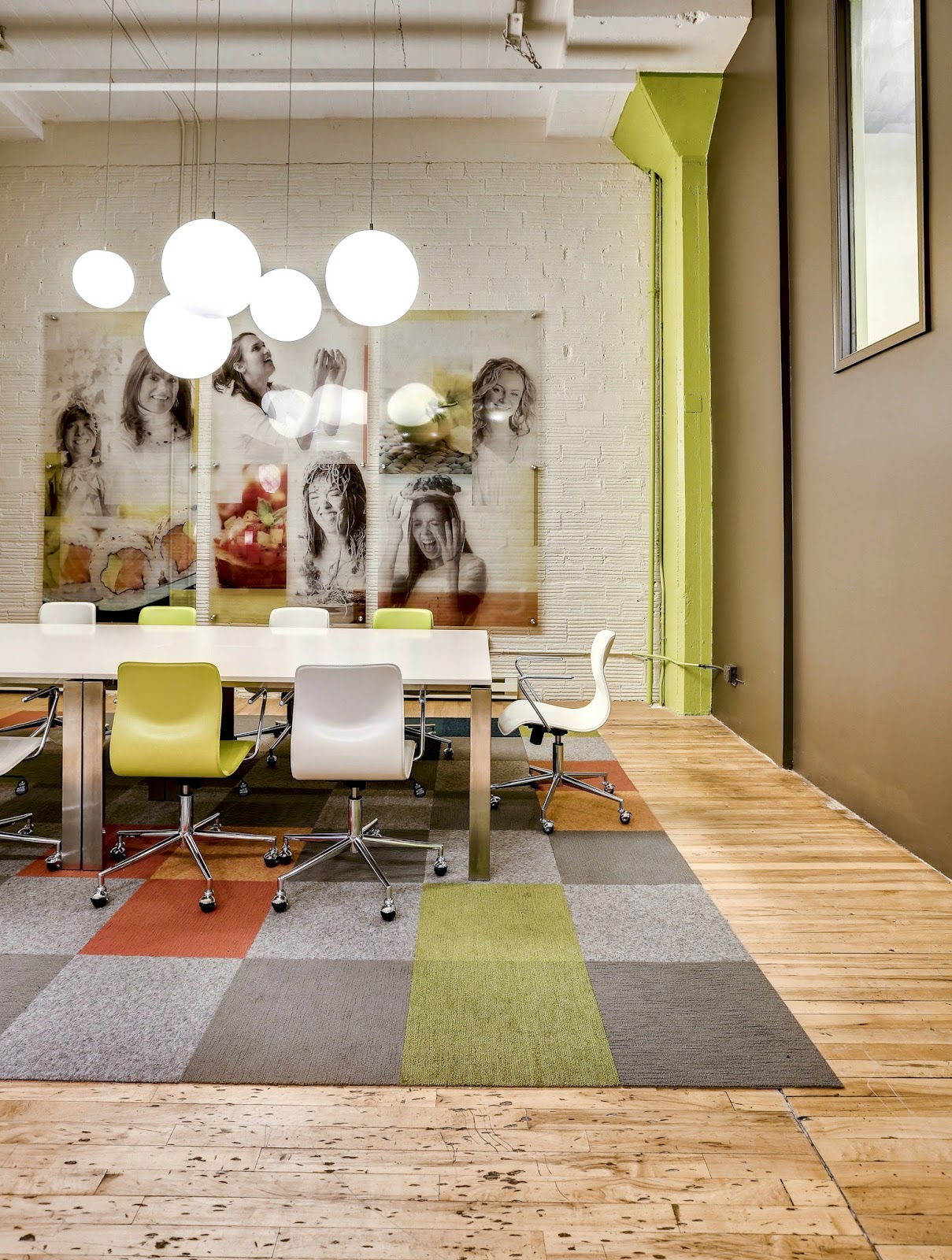
 Marketing firm with brick painted Alabaster, along with vivid company branding colors.

Coffee shop with extra white on walls and ceiling, contrasted with shadowy gray accents.
Clean and crisp.  Whites freshen and brighten interior spaces. I welcome the whites but will continue to incorporate and showcase COLOR into my interiors as well.

-Jodi Kuznia
Interior Design Principal 
Sienna Lynn Studio 

Wednesday, September 16, 2015

cha-cha-cha-changes


Even as an adult, I love back-to-school time and the change of seasons. You can feel it, you can see it.
A fresh start. 

https://instagram.com/jodi_sienna5lynn/

Friday, December 5, 2014

2015 color of the year

It's here...the color of the year for 2015: 


Marsala

For decades, Pantone's Color of the Year has influenced product development and purchasing decisions in fashion, home and industrial design, as well as product packaging and graphic design. Here's what they say about the color that will be appearing throughout fashion and retail design in the near future: 
“This earthy red has wine and a very warm brown underneath, which gives the feeling of groundedness, strength, and confidence,” says Leatrice Eisman, Executive Director of Pantone Color Institute. “It has a richness that lends sophistication.” 

A departure from the last few years of bright hues, we're seeing mixed emotions on this color choice.  What's your reaction? 

Monday, March 24, 2014

beauty bar

Brooke's Beauty Bar is lookin' great and opens next week.   
Working on translating her boutique brand throughout the new hair salon. 
Beautiful decor pieces will compliment the custom retail, beverage area, and hair styling space.  So fun!


Wednesday, March 12, 2014

hand-drawn

 It may be a lost art, but I love hand drawing and rendering plans. 
Happy to find the perfect prismacolor markers to match the design scheme.


...And done!

Tuesday, February 11, 2014

paint selection 101


One object that makes it to every design meeting: my paint color fan deck.  As a designer, I've memorized many of the colors by name.  I walk into restaurants or offices and find myself thinking, 'Oh that Portabello accent wall looks great next to Relaxed Khaki!'  I usually don't say that out loud...kinda weird.

Anyway, I absolutely love selecting the perfect color for a space.  I see many clients overwhelmed with the selection process, with paint samples taped all over, clearly stressed about the decision.  

 I'm offering some helpful tips:

...Still need help with paint color selection and specifications?  Contact Sienna Lynn Studio for a consultation: jodi@siennalynnstudio.com

Friday, December 6, 2013

2014 color of the year

Hey color lovers, Pantone just announced the color of the year:


Radiant Orchid!  
According to Pantonethis color is "an enchanting harmony of fuchsia, purple and pink undertones that inspires confidence and emanates great joy, love and health."

For more than a decade, Pantone's Color of the Year has influenced product development and purchasing decisions in fashion, home and industrial design, as well as product packaging and graphic design.  


Ultimately the consumer decides…will you be wearing or buying Radiant Orchid this upcoming year?  It's fun to watch for the new "it" color!

Friday, April 5, 2013

auto

Working on schmatic plans for an auto collision center!  The furniture and architectural finish pallettes are inspired by the automotive industry.  A mix of clean lines, vibrant accents, with a comfortable waiting area.

Option 1 - Red Inspiration:

Option 2 - Blue Inspiration:

Friday, March 22, 2013

downtown

The lofts' building remodel is moving along.  The new color scheme, entry tile, carpet, metal base, and lighing look great.  Common areas will be complete with: new cooridor ceiling design, solid surfaces, signage, and décor.
   Before:
    ...After:


Before:
    ...After:

Tuesday, February 19, 2013

collide


"Creativity represents a miraculous coming together of the uninhibited energy of the child with its apparent opposite, the sense of order imposed on the disciplined adult intelligence."
 -Norman Podhoretz     
            (art by sienna lynn studio)

Wednesday, February 13, 2013

options

Working on an exterior project.  With landscape, signage and paint, the building gets a face-lift.  Light, fresh, inviting.
Before: 

Proposed Rendering:

Friday, January 25, 2013

walls, floors, ceilings


New walls are up and painted, soon followed by floor and ceiling upgrades.  Meanwhile, we finalize private office furniture, workstation layouts and specifications.  Architectural designs, and details to come...