NEXT UP | Another office building full remodel.
Dramatic red accents will be incorporated in paint, furniture, signage, custom art murals and installations throughout. Can't wait.
And guess what? Benjamin Moore just announced their 2018 Color of the Year, which happens to be...RED.
"This year's choice will stop you in your tracks." - Benjamin Moore
Wednesday, October 25, 2017
Tuesday, October 24, 2017
office makeover
Our recent office make-over showcases how updating a workspace design to align with the company brand creates positive results...mentally and physically!
All new furniture, paint, and artwork.
We started with lighter walls and custom furniture, including sit-to-stand desks for all employees. There are significant physical health benefits with adding sit-to-stand desks into offices.
(See article: https://www.huffingtonpost.com/thomas-b-trafecanty/the-benefits-and-consider_b_9996782.html)
Also, incorporating art into the workspace has proven emotional benefits including stress reduction.
(See article: https://mic.com/articles/106504/science-shows-that-art-is-having-fantastic-effects-on-our-brains-and-bodies#.YemXGgoN5)
There are so many factors that contribute to well-being and efficiency in the work environment. Design affects so much!
All new furniture, paint, and artwork.
We started with lighter walls and custom furniture, including sit-to-stand desks for all employees. There are significant physical health benefits with adding sit-to-stand desks into offices.
(See article: https://www.huffingtonpost.com/thomas-b-trafecanty/the-benefits-and-consider_b_9996782.html)
Also, incorporating art into the workspace has proven emotional benefits including stress reduction.
(See article: https://mic.com/articles/106504/science-shows-that-art-is-having-fantastic-effects-on-our-brains-and-bodies#.YemXGgoN5)
There are so many factors that contribute to well-being and efficiency in the work environment. Design affects so much!
Friday, September 22, 2017
glass view
PALETTE | Office space in Minneapolis, with new furniture, finishes, and branding. Lots of glass and skyline view.
New bright reception area photos to follow...
Thursday, August 31, 2017
Friday, March 10, 2017
this
Finally seeing our design in person.
Enormous custom barn doors separating the new open office area from the conference room.
A creative work environment for a creative marketing agency. I want to work in this space!
Enormous custom barn doors separating the new open office area from the conference room.
A creative work environment for a creative marketing agency. I want to work in this space!
Monday, December 19, 2016
greenery in the loop
Pantone selected the color of the year for 2017:
Sienna Lynn Studio's current project in Minneapolis' North Loop showcases this fresh, vibrant color.
An office remodel gets new workstations with sit-stand desks, new carpet, and lighting.
Next month's installation...a new divider wall with12' custom barn doors to separate the work area and conference room. Stay tuned for more photos.
Sienna Lynn Studio's current project in Minneapolis' North Loop showcases this fresh, vibrant color.
An office remodel gets new workstations with sit-stand desks, new carpet, and lighting.
Next month's installation...a new divider wall with12' custom barn doors to separate the work area and conference room. Stay tuned for more photos.
Friday, November 18, 2016
sienna
People often ask about the name of my interior design business. Here are a few fun-facts behind the origin of Sienna Lynn Studio.
A color.
The paint tubes of sienna (raw and burnt sienna) are used in almost every painting that I've done. A trick I learned from one of my painting professors in collage: adding sienna while mixing the paints, creates a similar undertone to the finished artwork.
A name.
As a mom of 3 boys, this name was not selected for those babies, however I chose it for my other baby -- my business. The year was 2009 and I followed my intuition to leave the corporate world (during the recession!) and begin a new journey. The unknown. Sienna Lynn Studio was launched to focus on my passions: helping people + design. Connecting with individuals and companies who understand that design can impact their business in so many amazing ways.
A place.
Siena is located in Italy, central Tuscany. I daydream of a future trip to Italy. The same year that I started Sienna Lynn Studio, I made a promise to myself that I would visit Siena for my 50th birthday. I was in my early thirties and this seemed like an eternity away, but this vision would make me smile during all the ups and downs of starting a business as a single mom. Now a family of five and only 10 years away!
A wine.
A favorite choice for red. Looking forward to many more years with Sienna Lynn Studio and continuing the unknown of each day.
Cheers!
Labels:
sienna lynn updates,
small business
Tuesday, October 18, 2016
Friday, October 7, 2016
turquoise escape
Although these few days went fast...every second was savored and appreciated.
Feeling so grateful for this get-away.
Tuesday, August 30, 2016
on trend
Announced today...
Sherwin Williams anticipates the defining color of 2017 as Poised Taupe.
Poised Taupe, the main color in the interior design finish palette. Combined with gold tones, wood and metal elements, this building re-fresh reflects the industrial chic of Northloop, Minneapolis.
Entry stairs with new 12"x 24" tile. Modern, clean lines update the common areas:
New lighting, carpet tiles, and metal floor base, along with Poised Taupe paint color:
Sherwin Williams anticipates the defining color of 2017 as Poised Taupe.
"This timeless neutral is modern, classic and a beautiful balance of warm and cool." - Sherwin Williams Color MarketingPerfect timing to share Sienna Lynn Studio's remodel of Second Street Lofts in North Loop which used this hue!
Poised Taupe, the main color in the interior design finish palette. Combined with gold tones, wood and metal elements, this building re-fresh reflects the industrial chic of Northloop, Minneapolis.
Entry stairs with new 12"x 24" tile. Modern, clean lines update the common areas:
New lighting, carpet tiles, and metal floor base, along with Poised Taupe paint color:
Thursday, August 18, 2016
Thursday, July 28, 2016
through the lens
Wednesday, June 8, 2016
details. function. beauty
Thrilled with the results of the new build-out for a financial management group! Sienna Lynn Studio was challenged with creating a beautiful, functional office design in a new, smaller space. With this new footprint, design is definitely in the details.
During construction:
...After!
Design Goals:
Maintaining efficiency in every square foot, while achieving transparency and light throughout the office. This was achieved not only with finishes and lighting, but in the architectural plans with a large window into the conference room, low walls in main areas, side-lights at each private office, and glass panels between workstations to allow natural light to filter through the interior.
Finish Palette:
Alabaster white, medium gray tones, and branded green accents come together with tailored, classic modern lines.
Furniture:
All new, custom furniture selected and designed for maximum function. Overhead storage, mesh-back chairs, and sit-to-stand desks provide flexibility and health benefits.
Accents:
Artwork from the clients' collection is showcased throughout, including colorful contemporary paintings and a commissioned Charlie Brown statue. In addition, a large custom metal "W" logo is featured, and a coat rack from local furniture designer Blu Dot stands in the reception area.
Thursday, March 3, 2016
feature
IN Food Marketing and Design's space
by Sienna Lynn Studio is the featured article in
Minneapolis-St. Paul Business Journal's "Cool Offices."
Labels:
interior design by sl,
sienna lynn updates
Friday, February 5, 2016
pantone sunrise
Rarely do I get out of the house by sunrise. This morning was an exception, which made the early morning drive worth waking up for.
The beautiful frozen landscape was lit up by the two Pantone Colors for 2016!

The pairing of pink and baby blue (Rose Quartz and Serenity) was selected by Pantone color experts to represent the color palette for design inspiration this year.
Already shown on the runways by Chanel, Prada, and Valentino. Both Fendi and Robert Cavalli have Spring collections for men and women with these two shades. Look for more blue for women, pink for men in the upcoming year in fashion, products, graphics and interior design.

The beautiful frozen landscape was lit up by the two Pantone Colors for 2016!

The pairing of pink and baby blue (Rose Quartz and Serenity) was selected by Pantone color experts to represent the color palette for design inspiration this year. Already shown on the runways by Chanel, Prada, and Valentino. Both Fendi and Robert Cavalli have Spring collections for men and women with these two shades. Look for more blue for women, pink for men in the upcoming year in fashion, products, graphics and interior design.
"Coinciding with societal movements toward gender equality and fluidity, the consumers’ increased comfort with using color as a form of expression which includes a generation that has less concern about being typecast or judged, and an open exchange of digital information that has opened our eyes to different approaches to color usage.” -Pantone Color Institute
Wednesday, January 6, 2016
construction junction
Design coming to life!

Space planning, furniture, and finishes in the works...

https://www.instagram.com/jodi_sienna5lynn/

Space planning, furniture, and finishes in the works...
https://www.instagram.com/jodi_sienna5lynn/
Monday, January 4, 2016
2016 color of the year
It may not come as a surprise that the color of the year is...white!
Sherwin Williams, along with other leading paint company's all agree that white is "it" for 2016.
Sienna Lynn Studio's view:
Although white walls and ceilings tend to brighten a space, it can also look unfinished or too stark if done without color in mind. The use of color becomes increasingly important with a primary palette of white. I do love Sherwin William's off-white "Alabaster" and have specified it frequently as a warm neutral. However there are also projects where a true, extra white works best. Emphasis your favorite furniture or artwork in residential, and showcase branding elements in commercial spaces. I especially like contrasting white with medium and dark gray tones.
Residential examples of white interiors by Sienna Lynn Studio:
Contemporary interior using extra white to highlight the clients' amazing art collection throughout and emphasizing pops of bright colors.
Commercial examples of white interiors by Sienna Lynn Studio:
Sherwin Williams, along with other leading paint company's all agree that white is "it" for 2016.
Architecture and interior design magazines have featured all-white interiors for quite a while. A neutral backdrop photographs well and perfectly highlights colorful furniture and artwork.Sherwin Williams selected Alabaster/SW7008 as their white for this year. They describe it as, "A straightforward and necessary shift to mindfulness. It provides an oasis of calmness, spirituality and ‘less is more’ visual relief. Alabaster is neither stark nor overly warm, but rather an understated and alluring white.”
Sienna Lynn Studio's view:
Although white walls and ceilings tend to brighten a space, it can also look unfinished or too stark if done without color in mind. The use of color becomes increasingly important with a primary palette of white. I do love Sherwin William's off-white "Alabaster" and have specified it frequently as a warm neutral. However there are also projects where a true, extra white works best. Emphasis your favorite furniture or artwork in residential, and showcase branding elements in commercial spaces. I especially like contrasting white with medium and dark gray tones.
Residential examples of white interiors by Sienna Lynn Studio:
Classic modern interior using Alabaster white with warm tones.
Commercial examples of white interiors by Sienna Lynn Studio:
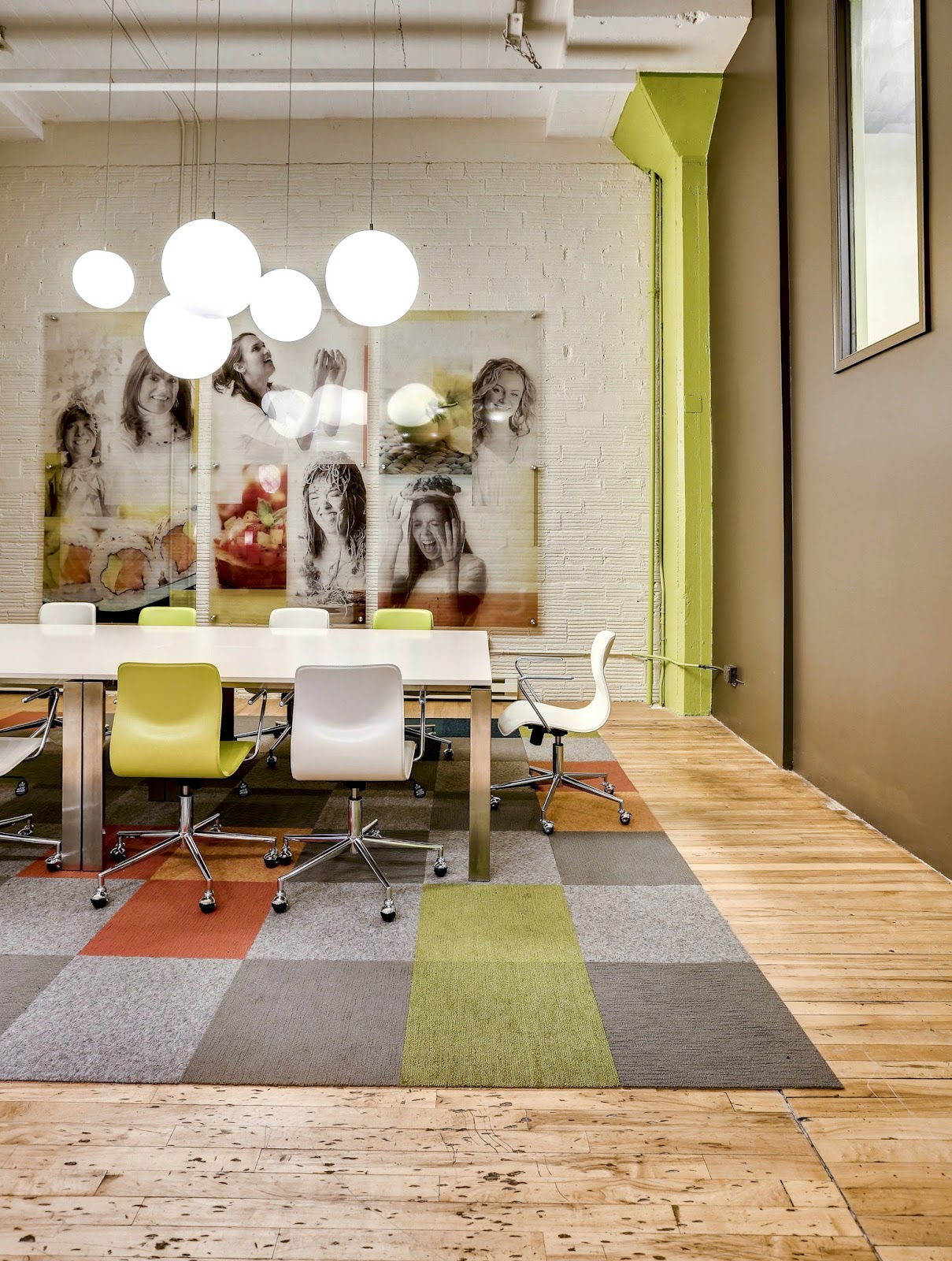
Marketing firm with brick painted Alabaster, along with vivid company branding colors.
Coffee shop with extra white on walls and ceiling, contrasted with shadowy gray accents.
Clean and crisp. Whites freshen and brighten interior spaces. I welcome the whites but will continue to incorporate and showcase COLOR into my interiors as well.
-Jodi Kuznia
Interior Design Principal
Sienna Lynn Studio
Sienna Lynn Studio
Subscribe to:
Posts (Atom)